Choosing the Right Chart for Your Life
“Data science turns chaos into tested insight by asking clear questions, testing on new data, and telling a true to life story people can use.”
We often choose the wrong chart for our lives. A pie chart makes us stare at slices of the whole. A bar chart lets us compare categories side by side. Pick the wrong one and you tell a false story. The same is true in psychology. The story you choose about yourself is a chart choice. If your whole identity is one slice called failure or illness, you see everything as part of that circle. If you line up experiences as bars, you can compare and learn. Some days are higher, some lower. You get information, not a verdict.
Data literacy gives us clean language for this. A pie chart is for composition. It answers how a whole is split. A bar chart is for comparison. It answers which item is bigger or smaller. Confusing the two creates bias. Thinking your mood on a single bad day represents the whole of you is a pie chart error. Refusing to compare patterns across days is a bar chart error. Both lead to poor decisions.
Now add the primary law of human nature. We deny we have one. We tell ourselves that irrationality and aggression live out there, in other groups, and not in us. Yet our wiring is shared. The same shortcuts that help us survive also make us misread data about ourselves.
We make the mistake of thinking a rare setback is normal. This is called base rate neglect. One bad day or one failure can feel like it defines us even though most of our days or actions are fine. We forget to see the bigger pattern and let a single event outweigh the overall reality.
We also cherry pick, focusing on one dramatic moment while ignoring the many ordinary days that make up most of our lives. When emotions run high we confuse noise with signal, giving too much importance to events that feel big but may not actually matter as much in the larger picture.
Definitions are models. They are not the territory. In mental health this matters. Take the word depression. The common definition frames it as a negative state, a drain that steals energy and meaning. That description captures real suffering, and it deserves care and support. Yet there is another useful definition that does not deny reality.
Think of depression as compression. When answers outside run out, attention is forced inward. The system reduces motion so it can check its own code. Compression can be pathology when it is crushing and chronic. It can also be a phase of redefinition when it is held with skill, support, and curiosity. This is not positive spin. It is a functional view. Something in you is asking for a redesign.
Data science offers a practical path to redesign. First, choose a target variable. Call it usable well being. Not a mood spike, and not numbness, but the capacity to act with clarity today. Next, list features that likely influence it. Sleep quality. Movement. Food regularity. Social contact. Meaningful work. Sunlight. Rumination time. Digital noise. Therapy or coaching.
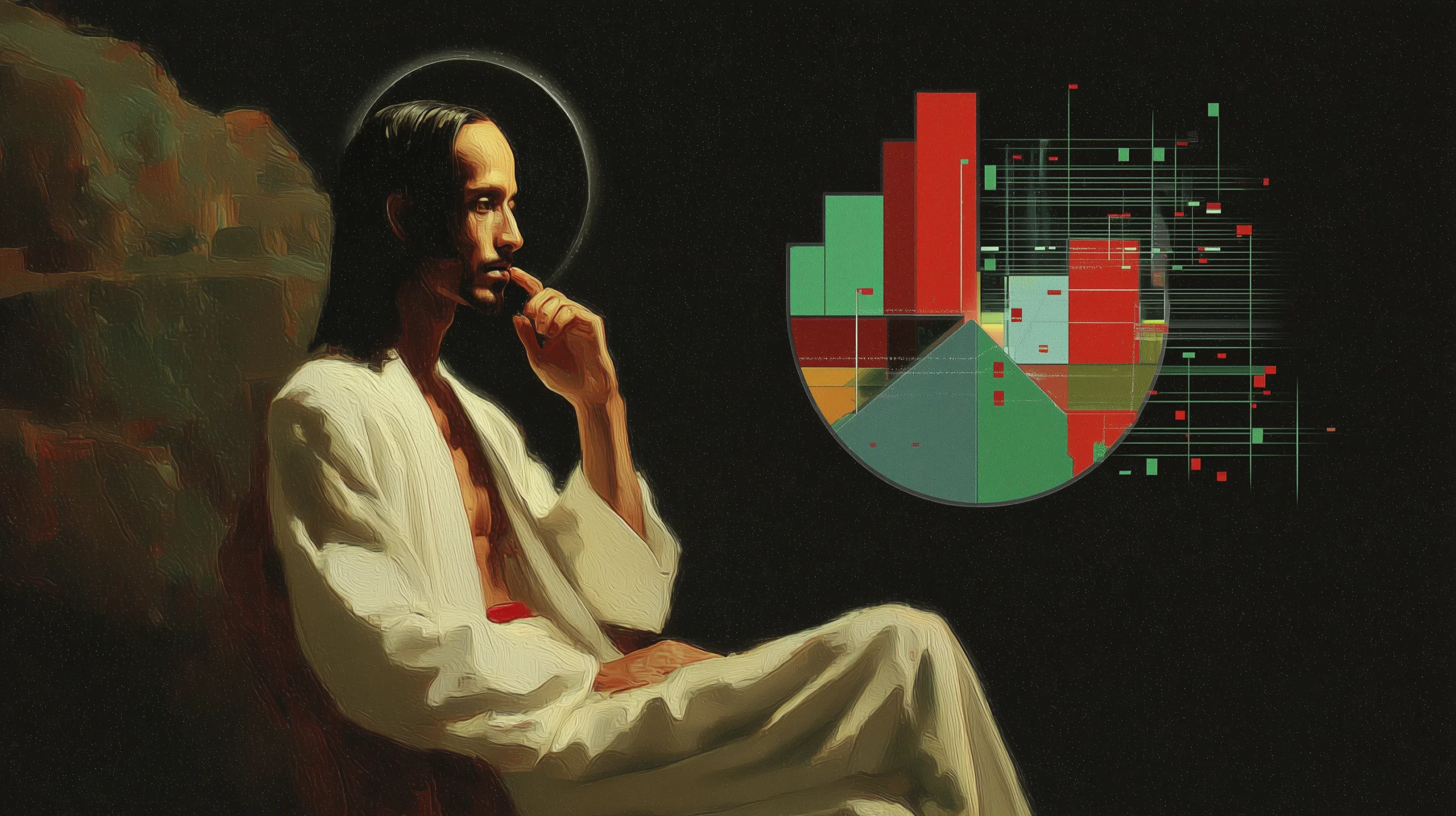
You do not need exotic sensors. A simple daily log in a spreadsheet is enough. Make one bar chart for each feature across the week and you will start to see which days are outliers. Make one pie chart for your day to see the composition of your time and energy. Both views are needed. Composition tells you where the day went. Comparison tells you what changed.
Be careful with common modeling traps. Leakage happens when the label sneaks into the features. If your daily note says bad day because I felt depressed, you have not measured a cause. You repeated the label. Instead, record observable inputs. Hours slept. Steps walked. Minutes in sunlight. Meals eaten. Conversations that left you nourished or drained.
Overfitting happens when you draw a strong conclusion from a tiny sample. Two bad Mondays do not prove Monday is cursed. Give yourself more data before changing your life. Cross validate through time. See if patterns hold across weeks and contexts.
Reframing depression as compression changes the experimental design. The question is no longer how do I stop feeling this right now. The question becomes what is my system trying to conserve or protect, and what new design would let it open safely.
Maybe the compression is asking for boundaries at work. Maybe it is asking for fewer inputs so attention can heal. Maybe it is asking for a new identity claim, from performer to craftsperson, from fixer to learner. These are hypotheses. You test them with small actions, not grand declarations. You change one variable at a time. You measure for two weeks. You compare bars. You adjust.
Accepting the shared nature of our flaws makes the work lighter. You are not uniquely broken. You are human. Everyone carries bias and blind spots. Knowing this, build guardrails the way a good data team does.
Create a daily checklist that prevents drift. Put the checklist where you cannot ignore it. Ask one trusted person to be your peer reviewer. When your story gets extreme, let them ask for evidence. The point is not to win debates. The point is to keep your model honest.
This approach respects both numbers and meaning. Numbers give you pattern, trend, and effect size. Meaning gives you values and direction. Without numbers you stay inside stories that never get tested. Without meaning you optimize metrics that do not matter.
The art is to let each correct the other. If your bars improve while your sense of aliveness falls, you are optimizing the wrong target. If your values feel noble while your sleep, food, and friendships collapse, your meaning is unmoored from reality.
A useful rhythm forms. Observe. Define. Test. Learn. Redefine. Awareness uses both pie charts and bar charts. The pie chart shows how your time, energy, and actions are split. The bar chart compares those areas across days or situations. Define the exact change you want to make, such as improving sleep or reducing screen time. Test by changing one factor and allowing enough days to measure its effect. Learn by seeing what the data shows and how your body responds. Redefine the plan in clear and simple words so it guides your next step.
Why do all this work. For some it is progress, family, money, status, belonging, safety. For others it is habit, fear, or sleepwalking with the crowd. The dark pulls are here too. Lust, envy, greed, hate, pride, shame, jealousy, anger. Life is not pure light or pure dark. It is a package of everything. No model holds it all.
So the real question is small and sharp. What will you do with the tiny slice of freedom you have. Call it 0.14 percent. Not from a lab and not from Sapolsky. It is a number that arrived through synchronicity. It stands for the little space where choice lives. Use it to tilt the bars and recut the pie. Choose one change that makes you more honest, more steady, more kind. Ask for help. Keep records. Tell the truth to yourself.
What do you want to become. A machine that chases metrics. Or a living organism that learns, plays, rests, repairs, and loves. Use your 0.14 percent to be alive. Practice hope as a daily habit. Turn trust into repeated action. Let progress be the quiet move you make today. Leave the world easier to carry for the next ones who come.
Treat UX as the feminine work of listening and easing flow, UI as the masculine work of giving clear shape, and data science as the deeper search for pattern. Use the pie to map where your time and energy go. Use the bars to see what your changes do across days. Spend your 0.14 percent on one honest change today, review tomorrow, and adjust. Over time this turns a life into something clear, kind, and effective.
“A data scientist is an evidence based storyteller. They turn clear questions into tested, true to life insight. They gather and clean data, map patterns and archetypes, surface outliers, confirm what holds, and discover what is new. They validate on fresh data, report uncertainty, state limits, protect privacy, and shape results into actions people can use.“